

大致思路:
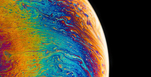
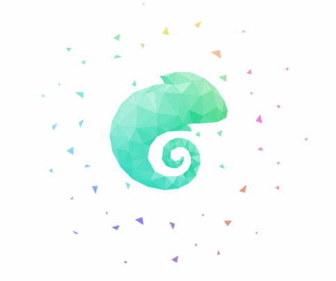
1、选取的图片为白底图片透明的图案
2、先设立一个大盒子wrap,在设立四个四个子盒子,一个盒子放图片另一个放颜色,只需要调一下z-index与over-hidden就可以实现为透明图片添加颜色。
<div id="wrap">
  <div class="bianselong"></div>
  <div class="bg-box">
    <div class="bg"></div>
  </div>
  <div class="dong"></div>
  <div class="dong-box">
    <div class="bg1"></div>
  </div>
</div>
css
* {
  margin: 0;
  padding: 0;
}

html,
body {
  width: 100%;
  height: 100%;
}

#wrap {
  position: relative;
  width: 440px;
  height: 440px;
  left: 50%;
  margin-left: -220px;
}

.bianselong {
  z-index: 3;
  background: url('./img/chameleon.png') no-repeat;
}

.bianselong,
.bg-box {
  position: absolute;
  width: 170px;
  height: 170px;
  left: 50%;
  margin-left: -85px;
  top: 50%;
  margin-top: -85px;
}

.bg-box {
  overflow: hidden;
  z-index: 2;
}

.bg {
  left: -200px;
  top: -200px;
}

.bg,
.bg1 {
  position: absolute;
  width: 984px;
  height: 984px;
  background-image: url('./img/palette.jpg');
  background-repeat: no-repeat;
  animation: wm 10s linear infinite;
}

.bg1 {
  left: 50%;
  top: 50%;
  margin-left: -492px;
  margin-top: -492px;
}

@keyframes wm {
  0% {
    transform: rotate(0);
  }

  100% {
    transform: rotate(360deg);
  }
}

.dong {
  position: absolute;
  width: 440px;
  height: 440px;
  background: url('./img/dong.png') no-repeat;
  z-index: 1;
  animation: wm 60s linear infinite;
}

.dong-box {
  position: absolute;
  width: 400px;
  height: 400px;
  left: 50%;
  margin-left: -200px;
  top: 50%;
  margin-top: -200px;
  border-radius: 50%;
  z-index: 0;
  overflow: hidden;
}
代码演示:
评论区